ePortal Redesign

Problem
How might we reduce friction in a complex healthcare platform used daily by providers and administrators while creating a foundation that scales with future enhancements?
Company
Community Care Behavioral Health
Product
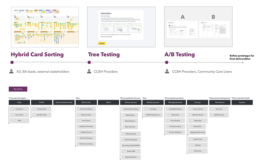
The ePortal is a secure enterprise web platform supporting authorizations, claims, credentialing, and system configuration across 43 counties
Role
UX/UI Designer (one of 3 designers; one of two researchers)
When
May 2024 - January 2026
ePortal Redesign

Strategy

The ePortal supports a wide range of users, including providers, administrative staff, and system admins. Each with their own variety of permissions, workflows, and levels of technical comfort. Over time, the homepage, masthead, and navigation became harder to navigate, increasing task friction and reliance on the help desk.

My approach focused on making users' everyday tasks easier to find and understand while still supporting the complexity required by advanced roles. Rather than treating this as a visual refresh, I prioritized foundational improvements to the:

  1. Navigation clarity and hierarchy
  2. Task visibility on the homepage
  3. Role-based patterns that scale as the platform grows

I worked closely with our product, engineering, and QA teams to phase changes in a way that balanced the usability improvements with technical feasibility.

Research

Research combined a variety of methods including; competitive audits, user interviews, card sorting workshops, tree testing (101 participants), and multiple rounds of A/B testing with both providers and internal staff. Early assumptions suggested users wanted more customization within the ePortal. However, research revealed a stronger need for clarity, predictability, and guided paths, especially for users juggling administrative responsibilities.

Key Insights: 

  1. Users struggled to understand permissions and why certain tasks appeared
  2. Alerts were too vague, overwhelming, or irrelevant to users
  3. Navigation labels were unclear for less frequent users
  4. New users lacked orientation and onboarding support

Scope of Responsibilities

  1. User research, problem statements, and mental models
  2. Information architecture
  3. Low to high-fidelity wireframes and prototypes
  1. A/B testing and usability studies
  2. Accessibility reviews (WCAG considerations)
  3. QA reviews and final design delivery
ePortal Wireframes
ePortal Wireframes
ePortal Wireframes

Solution

The ePortal redesign centers around a clearer, role-aware navigation system and a task-driven homepage that supports both efficiency and orientation.

Core improvements include:

  1. Grouped navigation based on user permissions and access
  2. Homepage quick links aligned to permissions and frequency
  3. Clearer, prioritized system and provider alerts
  4. Simplified admin and system flows; eg. onboarding, entity selection, and emulation
  5. Scalable components aligned with updated design standards
ePortal Mobile

The final solution balances familiarity for experienced users and includes guidance for newer or less frequent users. The ePortal redesign centers around a clearer, role-aware navigation system and a task-driven homepage that supports both efficiency and orientation.

For a deeper look at the research, iterations, and testing behind this redesign:

View Full Case Study Deck (PDF)

Outcome

Both navigation concepts tested well, but users with lower technical familiarity consistently preferred the Operator model.

  1. 90.4% task completion for Version A
  2. Faster task discovery and reduced onboarding confusion
  3. Strong preference for text + icon treatments over icon-only navigation

Based on these results, Version A was refined and selected for build. Early feedback highlighted improved clarity, confidence, and ease of navigation.

“It’s much easier to understand where I am and what I need to do next.”

ePortal Mobile

Reflection

This project reinforced the importance of balancing familiarity with improvement. Small, intentional changes to navigation, language, and hierarchy had an outsized impact on usability. It also strengthened my experience collaborating across teams and advocating for user needs while working within real technical and business constraints.

Next Steps

  1. Expand the redesign to additional workflows (claims, credentialing)
  2. Introduce advanced search and filtering within navigation
  3. Continue measuring efficiency gains to further reduce help desk load

Projects

View other projects.

Open Maverick Medical Education ProjectOpen Gulfport Luxury RV Resort Project