Rebranding Maverick
Medical Education

Problem
How might we redesign Maverick Medical Education’s outdated website to make course information easier to find and encourage enrollment?
Role
Website Designer & Developer
Project Duration
6 weeks
Industry
Healthcare, Education, eCommerce
Maverick Medical Education Rebrand

Overview

Maverick Medical Education is a healthcare learning company offering hands-on training courses for medical professionals. As a solo designer and developer at a marketing agency, I led the end-to-end redesign and rebrand of their website. I aimed to modernize the interface, improve usability, and better support course discovery and enrollment. The result was a visually refreshed, conversion-focused website that improved engagement and reduced bounce rates, despite operating within a fast-paced timeline and using an external eCommerce platform (Shopify).

Maverick Medical - Mobile + Web

Project Goals

  1. Modernize the brand and visual identity
  2. Improve navigation and access to course information
  3. Increase engagement and reduce bounce rates
  4. Support course enrollment through clearer CTAs

Project Constraints

  1. 6-week timeline
  2. Shopify handled all e-commerce transactions
  3. Website served as the primary discovery and conversion entry point

Insights

Although this project was UI-heavy, all decisions made were grounded in behavioral insights and performance data rather than assumptions.

Key takeaways:

  1. User Research: Found that users were motivated by course access and scheduling, but struggled to locate calendars and session details
  2. Market Behavior: Shopify purchase data showed increasing interest that was not reflected in on-site engagement
  3. Visual + UX Audit: Pages lacked visual appeal, hierarchy, and clear calls to action
  4. Original User Flow Analysis: The registration flow was long and unintuitive, causing users to drop off the website.

These insights informed me that simplicity, hierarchy, and visibility of key actions mattered more than adding new features to the redesign.

Design Strategy

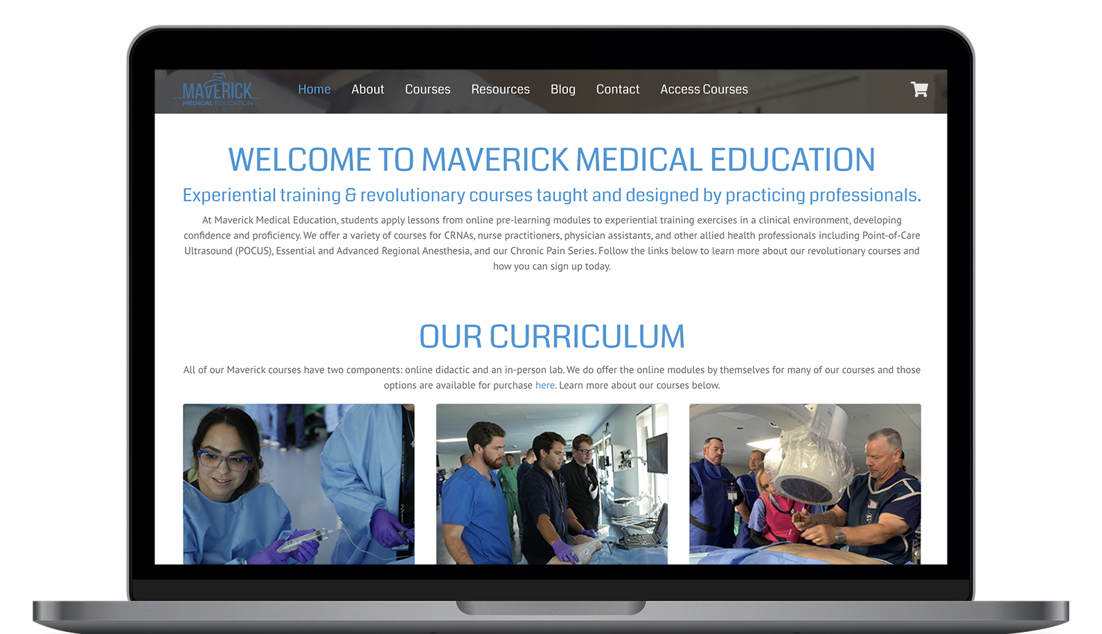
Rather than designing purely on the aesthetics of the site, I focused my time on improving usability, visual hierarchy, and increasing conversions. With a 6-week timeline, structure and visuals were refined in parallel rather than through rigid design phases. Frequent client feedback helped keep the work aligned while moving quickly toward implementation.

Strategic focus areas included:

  1. Streamlining the path from homepage → course → registration
  2. Improving the information architecture and content grouping
  3. Making course availability and calendars visible immediately
  4. Using bold, modern visuals to build trust and energy
  5. Ensuring responsiveness across all breakpoints

With a 6-week timeline, structure and visuals were refined in parallel rather than through rigid design phases. Frequent client feedback helped keep the work aligned while moving quickly toward implementation.

Solution Concept

Based on user goals and behavior insights, the redesigned site presents a clean, modern interface that guides users from exploration to specific actions with minimal friction.

Maverick Medical Education Features

Impact

The final redesign delivered a more engaging, conversion-driven experience that aligned visual clarity with business goals.

+15.6% increase in average session duration (133 seconds)
−8.4% reduction in bounce rate (30.69%)
+2% increase in pages per session (4.64 pages)

These improvements reflected stronger user engagement and clearer pathways toward course enrollment.

Reflection

This project demonstrated how thoughtful UI decisions can directly influence business performance, especially in specialized industries like healthcare.

What I learned:

Projects

View other projects.

Open ePortal Redesign ProjectOpen Gulfport Luxury RV Resort Project